UX, Art Direction & Design: Sprint-to-T-Mobile Migration & Network Sunsetting
The Ask
I was tapped to lead design across several Sprint-to-T-Mobile migration initiatives, including a landing page explaining the retirement of Sprint’s 2G and 3G networks and helping customers understand when they needed to upgrade to compatible devices. We also created a separate experience to incentivize eligible Apple and Samsung customers with free device upgrades. A key part of the work was helping visually bridge the Sprint and T-Mobile brands as the merger progressed.
The Solution
Phase 1: Explain the Change
We initially designed the network retirement experience to be content-heavy. Customers needed context, so FAQs were placed prominently near the top of the page, with CTAs directing them to customer service or a store for help.
At this stage, the priority was education. We wanted to make sure customers understood what was changing, why it was happening, and what they could do next.
Phase 2: Help Customers Take Action
After several months of analyzing page analytics, I saw an opportunity to shift the experience from education to action.
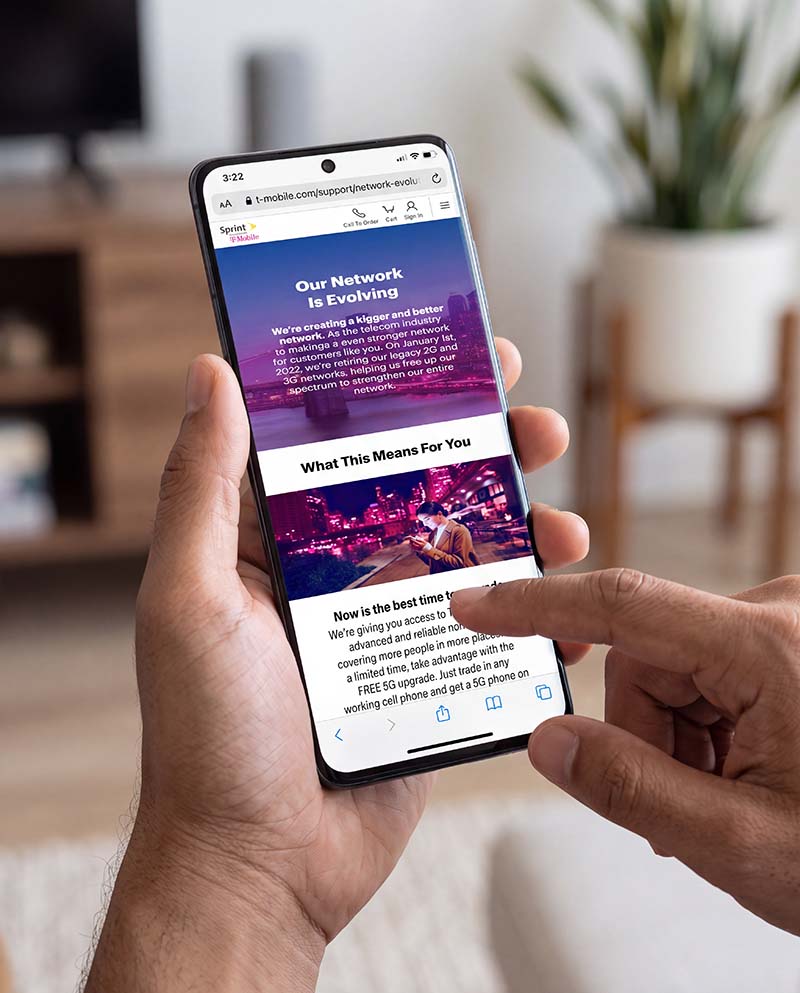
I pushed for a second phase with significantly less content and more personalized information. Instead of asking customers to figure out what applied to them, we could tell them what they needed to do based on their account.
I worked closely with our development team to design a simple phone number checker that allowed customers to enter their information and immediately see how many devices on their account needed new SIM cards or needed to be replaced.
From there, customers could log in and begin the upgrade process.
Evolving the Brand
At the same time, I helped guide the visual transition between Sprint and T-Mobile. We began phasing out Sprint’s large yellow CTAs in favor of smaller black buttons and introduced T-Mobile magenta into our iconography and supporting visual elements.
The goal was to make the transition feel gradual and intentional while establishing a foundation for the eventual T-Mobile experience.
The UX Evolution
The two phases reflected a larger shift in our approach:
Phase 1: Tell customers what is happening.
Phase 2: Tell customers what they need to do.
By using analytics to challenge the initial content-heavy approach, we were able to move the experience toward personalization and action, reducing the amount customers needed to figure out on their own. Clickable prototypes are below.
2G/3G Retirement Phase 1 (Scrollable Prototype)
2G/3G Retirement Phase 2 (Scrollable Prototype)
Clickable: Check Your Devices Button
Apple + Samsung Upgrade Offers (Scrollable Prototype)
Clickable: Set Retail Appointment Button