UX, Art Direction & Visual Design: Sprint Plans
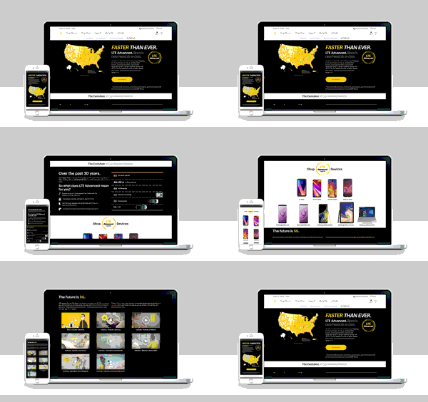
I led the end-to-end redesign of Sprint.com’s Plans experience, transforming what had become little more than a static comparison chart and a collection of promotional banners into a customer-focused decision-making tool.
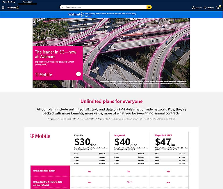
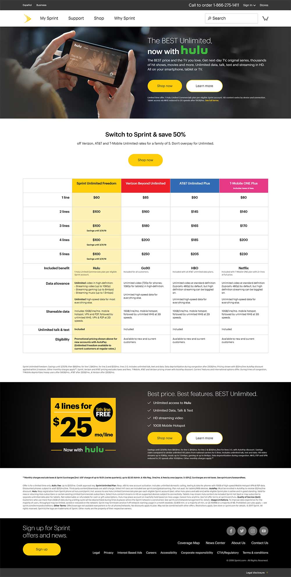
The existing page compared a single Sprint plan against one plan from Verizon, T-Mobile, and AT&T while relying heavily on marketing messaging.
Rather than helping customers understand which plan was right for them, it created friction, confusion, and unnecessary complexity throughout the shopping journey.
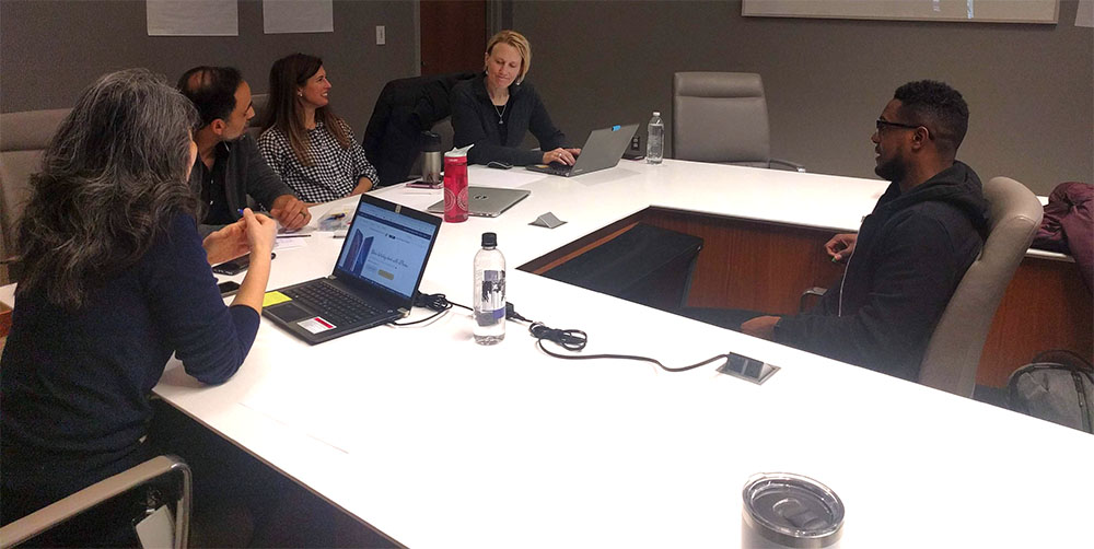
The redesign was driven by user research, analytics, and a Sprint.com Design Jam where cross-functional teams explored customer journeys, reviewed competitor experiences, and rapidly ideated solutions through collaborative whiteboard sessions and wireframes.



Research & Insights
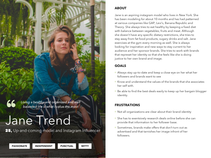
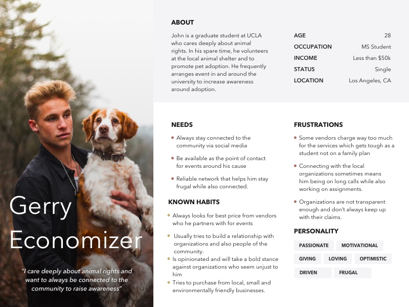
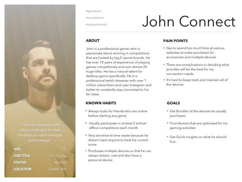
Our research uncovered recurring pain points across Sprint.com.
Site-wide findings
- Customers felt overwhelmed and confused by the shopping experience
- Large marketing imagery consumed valuable screen space while providing little utility
- Plans and devices were presented as separate experiences rather than connected decisions
- Promotions lacked relevance to individual customer needs
- Pages required excessive scrolling before customers reached meaningful information
- Industry terminology, including Flex Lease, was poorly explained
Plans experience findings
The Plans section revealed even larger usability issues.
- Marketing messaging outweighed practical information
- The All Plans page didn’t display pricing and prioritized add-ons instead of helping customers compare plans
- The Unlimited Plans page was long but uninformative, making decision-making difficult
- Competitive comparisons appeared near the bottom of the page, long after many users had abandoned scrolling
- Not every available plan was represented
- Information hierarchy made comparisons difficult
- Sprint’s definition of “Unlimited” wasn’t immediately clear
- Included benefits like Hulu, TIDAL, device protection, and security services were promoted inconsistently
- Selecting a plan wasn’t possible without first choosing a phone or contacting customer service
Design Constraints
The redesign had to work within significant technical and organizational constraints.
Sprint.com was built in Adobe Experience Manager with an extremely limited library of existing components, and no additional development resources were available for the initial release. Every improvement had to be achieved using the tools already in place.
Legal review introduced another layer of complexity. Partnerships with Amazon Prime, Hulu, TIDAL, and other benefit providers required ongoing coordination between Sprint Legal and multiple partner legal teams. My team served as the facilitator and negotiator throughout the review process, balancing legal requirements, business goals, and customer experience to ensure benefit descriptions were accurate, compliant, and easy to understand without overwhelming customers with lengthy disclaimers.
To balance clarity and compliance, I introduced contextual tooltips that surfaced important details only when customers needed them, allowing the page to remain clean while still communicating complex information.
Design Solution
Working within a mobile-first framework and finite component options, we reimagined the experience around progressive disclosure.
Instead of presenting every piece of required information simultaneously, we organized content into digestible tabs supported by modal windows and lightboxes. This dramatically reduced cognitive load while allowing customers to explore details only when they were relevant to their decision.
The redesign shifted the experience from a marketing landing page to an interactive planning tool—making pricing, plan differences, included benefits, and competitive comparisons significantly easier to understand.
Art Direction
This project also became the starting point for a broader visual strategy across Sprint.com.
Rather than relying on generic lifestyle photography, I introduced imagery focused on authentic moments that reflected a wider range of ethnicities, ages, and abilities. The visual direction established here later evolved into the broader brand visual strategy I developed following the homepage redesign.
Interestingly, after launch, several competitors adopted interaction patterns that closely resembled elements introduced in Sprint’s redesigned Plans experience.




Results
Redesign 1
The first redesign contributed to significant business impact alongside my subsequent homepage redesign.
- 169.3% increase in Black Friday conversions
- 22% increase in overall conversions
- 18% increase in product orders
These gains demonstrated that simplifying complex product information could improve both customer understanding and business performance.
Mobile View
Desktop View
Redesign 2
Several months later, after gathering additional behavioral data and customer feedback, our team revisited the Plans experience.
Leadership requested that the content from the original three-tab experience be consolidated onto a single page. While we knew simply stacking the existing content would create another overwhelming experience, the request became an opportunity to rethink the flow entirely.
Unlike the first iteration, this solution would require new development resources. By this point, I had spent considerable time rebuilding relationships between Sprint’s digital design and engineering teams, allowing us to advocate successfully for a more ambitious implementation.
Getting the device and plans selector right meant becoming temporary experts in Sprint’s pricing logic.
My team and I dissected marketing briefs, promotional offers, and every pricing permutation to make sure the experience reflected the business accurately.
Thankfully, our senior copywriting teammate was the resident pricing-math genius (I went to art school 🤷🏽♀️), and together we untangled all that complexity into something customers could actually use.
Rethinking the Selection Experience
Instead of simply reorganizing content, we redesigned how customers selected a plan.
The new concept transformed the Plans page from an informational destination into the first step of the purchase journey. Customers could:
- Compare Unlimited Basic, Plus, and Premium side-by-side
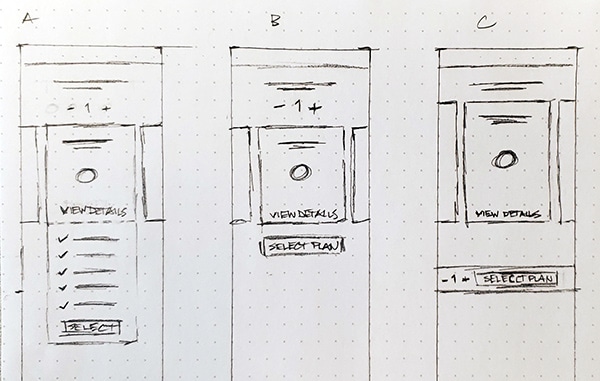
- Adjust the number of lines using an interactive line counter
- Instantly view multi-line pricing
- Select a plan before shopping for a device
- Carry their selected plan seamlessly through the purchase funnel with visible confirmation at each step
- Complete their plan purchase online, eliminating a previous requirement to call customer service to finalize plan selection
User Testing
To validate the experience, we conducted usability testing around two key interactions:
- Should pricing be displayed as price per line or total monthly cost?
- Should the line counter remain inside Plan Details or live in a persistent sticky footer?
We developed two mobile prototypes and tested both experiences with customers.
Experience A – Sticky Footer
Experience B
Outcome
Participants overwhelmingly preferred:
- Seeing total monthly cost instead of price per line.
- A persistent sticky footer that kept plan selection visible throughout the experience.
Those insights directly informed the final experience, where customers could confidently compare plans, understand pricing at a glance, and continue directly into device selection with their chosen plan already confirmed.
Final Flow
- UX Lead: A. Nash
- UX Research: S. Vipparti
- Copywriter: G. Gniffke