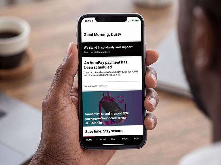
UX, Art Direction & Design: Sprint-to-T-Mobile Migration & Upgrade Offers
The Ask
I led design for several Sprint-to-T-Mobile migration initiatives, including a landing page that encouraged Sprint customers to transition to the new network and take advantage of Apple and Samsung upgrade offers.
The challenge was making a complicated migration process feel straightforward. My copy partner and I structured the experience around two fundamental questions: Why should I switch? and How do I switch?
The Approach
The Why
We focused on the reasons customers should make the transition, including access to T-Mobile’s premium network and benefits like Scam Shield and T-Mobile Tuesdays, along with device upgrade opportunities.
The How
We broke the migration process into clear, actionable steps:
- Schedule an in-person upgrade appointment
- Bring your device
- Upgrade at least one device to an iPhone 12 5G or Samsung Galaxy S21
- Select a T-Mobile plan
- Take advantage of additional migration benefits
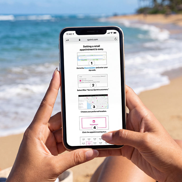
The appointment process itself required another 6 steps, creating an opportunity to simplify a potentially overwhelming journey.
I designed a modal that guided customers through the process without taking them away from the migration experience. From there, they could:
- Enter their account information
- Find a nearby store using the Store Locator
- Filter for locations that served Sprint customers
- Select their preferred location
- Choose a date and time
The goal was to turn a complicated, multi-step migration into a clear path forward, giving customers enough information to understand the value while providing the tools they needed to actually make the transition.
Evolving the Visual Language
The migration also required us to begin visually bridging the two brands.
In preparation for the merger, we had already started phasing out Sprint’s large yellow buttons in favor of smaller black CTAs. I also revamped our iconography to introduce T-Mobile’s magenta alongside other elements of the emerging brand language.
These changes helped the experience feel like a natural transition rather than a sudden visual shift, while giving us a foundation for the broader design evolution from Sprint to T-Mobile.
View the full pages in mobile and desktop below.