UX, Art Direction & Design: Sprint Hulu Benefit
Making the Hulu Benefit Easier to Understand
The Ask
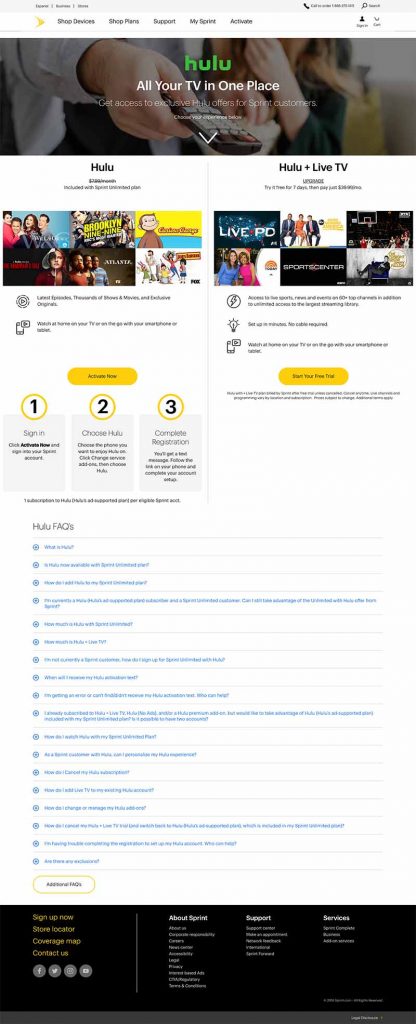
I led a redesign of the Sprint partner landing page for Hulu, a benefit included with any Sprint Unlimited Plan. The existing page had a few problems that made the experience harder to understand than it needed to be.
The hero image didn’t adapt well across desktop, tablet, and mobile. The instructions for claiming the benefit were large but still incomplete. A medium headline banner and large CTA banner took up a lot of valuable space, and three of the actual benefits were pushed below all of that.
We also needed to introduce Hulu + Live TV, which was available as a 7-day free trial.
The Approach
I wanted to simplify the page and make the value of the benefit much easier to understand.
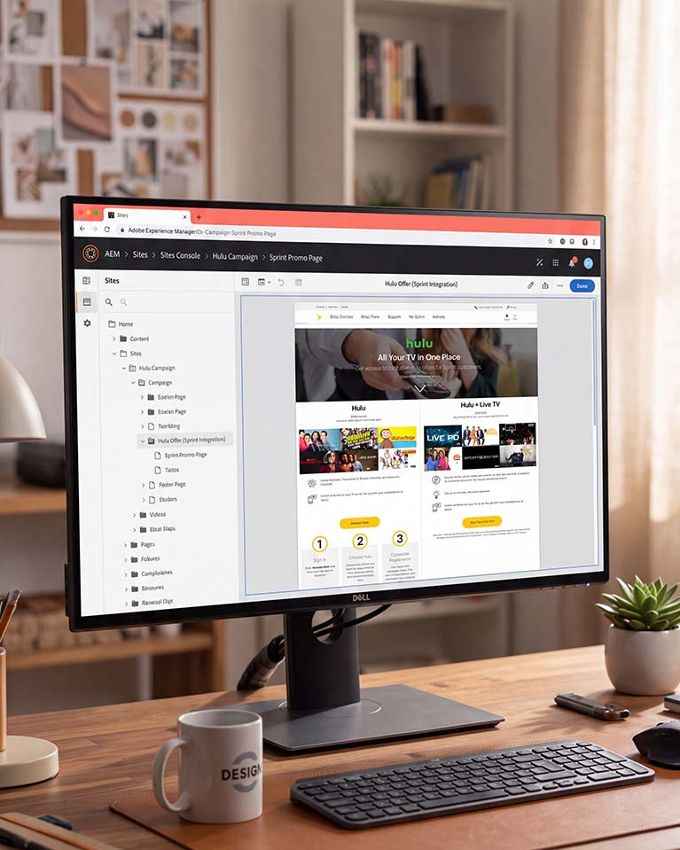
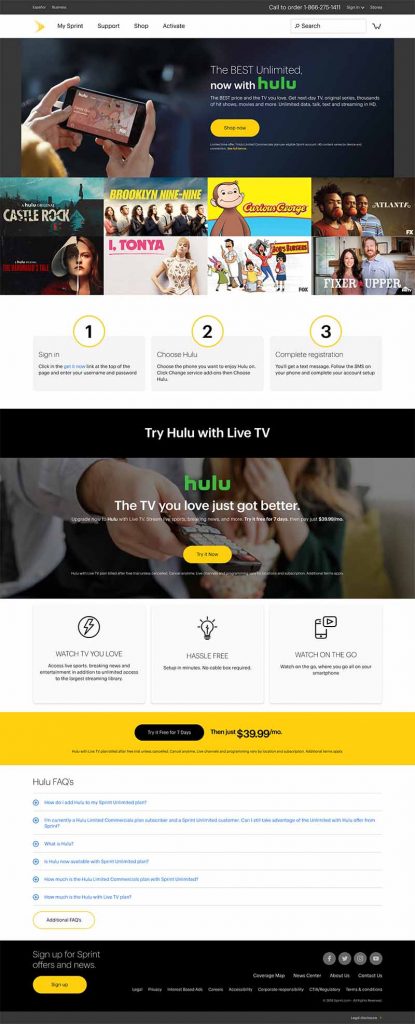
I started with a single hero banner that used the visual content to naturally lead customers into the information below. From there, I made Hulu and Hulu + Live TV easier to compare by showing examples of the TV content available with each option.
Instead of presenting the benefits as large blocks of copy, I pulled them into scannable lists led by icons. This gave customers a quick way to recognize what they were getting without having to read through long sections of text.
The claiming instructions were another area I wanted to clean up. I worked closely with my copy partner to fill in the missing information and make the process easier to follow. We also created two distinct CTAs so customers could quickly identify and follow the correct path based on which Hulu option they wanted.
Finally, my copy partner and I expanded the FAQ section to address more of the questions customers might have before signing up.
The overall goal was pretty simple: less scrolling to find the value, less effort to understand the benefit, and clearer paths to take action.
Before
After