UX, Art Direction & QA: Sprint Homepage Redesign
The Ask
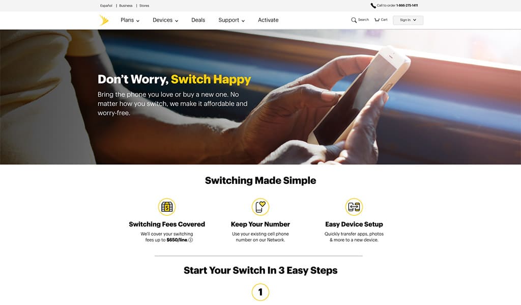
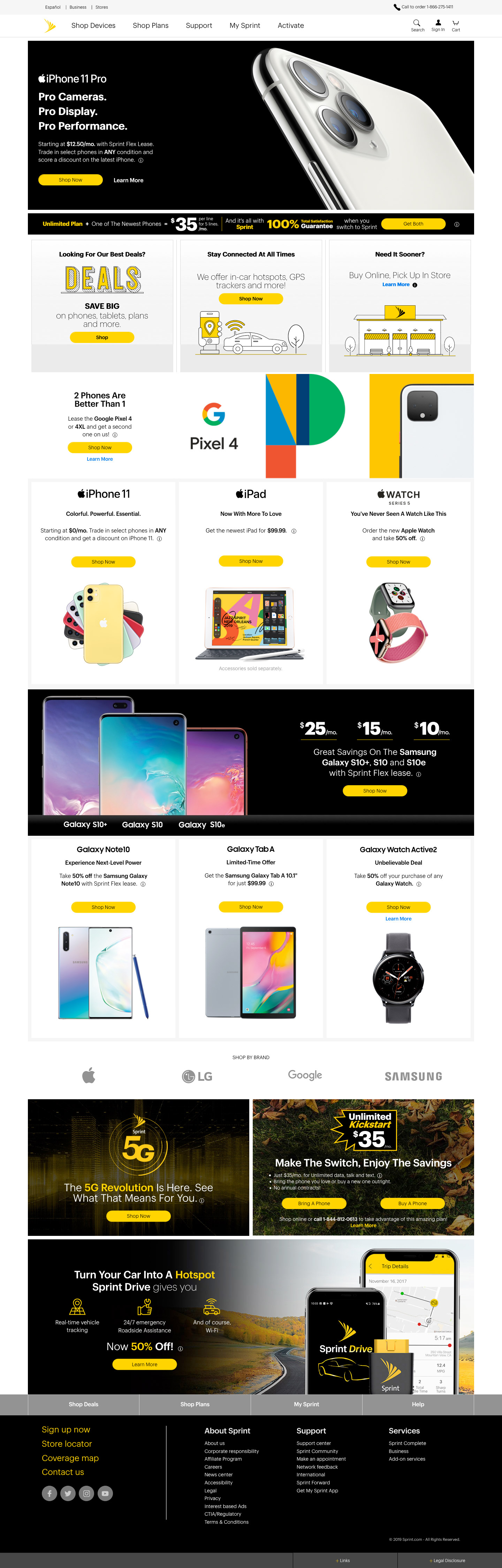
Take a cluttered, “deals, deals, deals!”-dominated homepage and minimalize it with our newly redesigned AEM (Adobe Experience Manager) components.
The Approach
Utilizing extensive research and user testing, my tight-knit team and I pushed beyond the ask to create what customers wanted to see from Sprint: a fresh design showcasing approachability, humanity, authenticity, and transparency.
I straddled visual direction, UX, UI, production, and a particularly hectic QA process 🫠. I also had to fight for the little things, like micro-animations on CTAs, that made the experience feel more alive.
Testing
Our surveys revealed something pretty straightforward: customers generally knew what they wanted when they arrived at Sprint.com.
If they came looking for the latest iPhone, they were there for the latest iPhone, regardless of how many times we promoted other deals. And if they were looking for a mid-tier smartphone, repeating iPhone promotions wasn’t going to change their minds.
So we stopped trying to convince people to want something they didn’t come for.
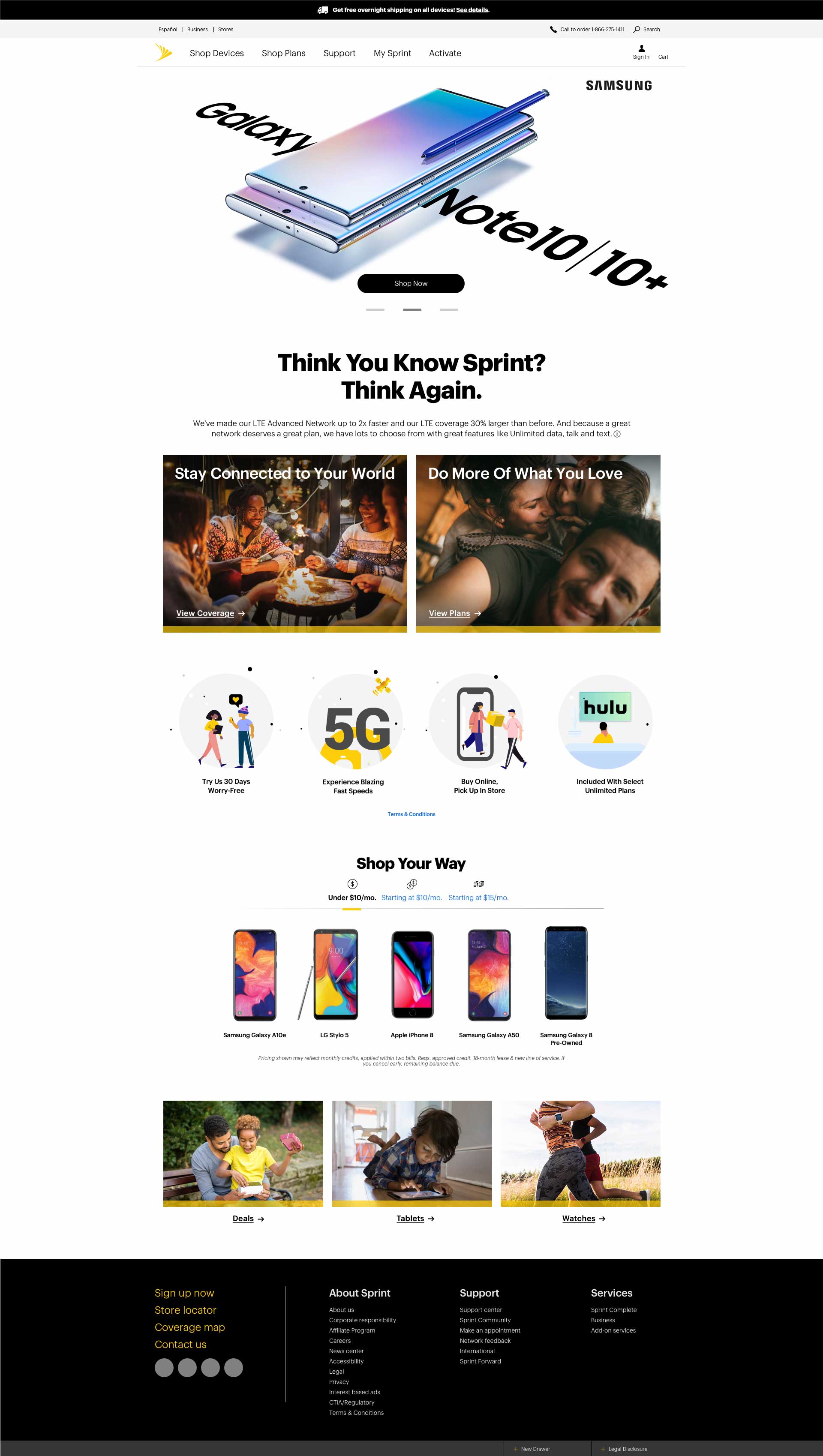
Instead, we created a structure that helped customers get where they wanted to go faster, paired with uncharacteristically bold messaging, playful illustrations, subtle hover animations, and photography that captured real people having real moments—with products and sometimes without them.
We also stepped back and asked a few fundamental UX questions:
- What do we provide? Price, Network, Service, and Convenience
- Why should you buy it?
- How do you get it?

We divided the page into 4 sections to answer:
1 — Rotating Hero
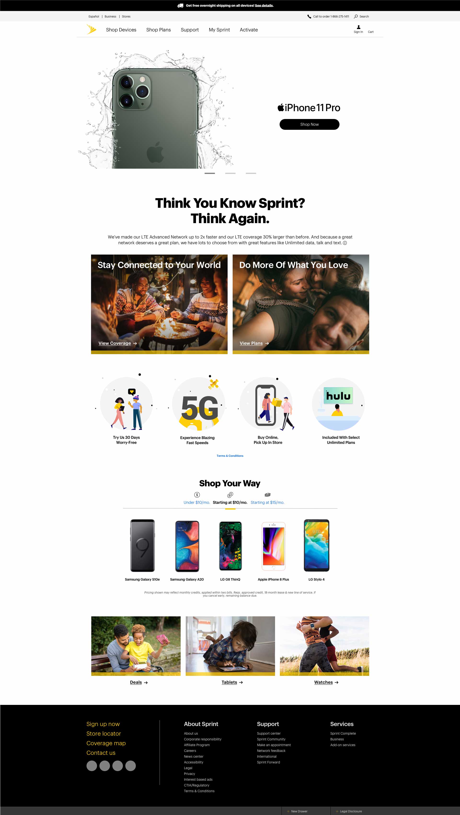
A rotating hero, intentionally limited to three items, focused on Iconic Devices and the most important messages.
2 — The Why
Network, Plans, and benefits like Hulu—giving customers reasons to choose Sprint beyond the device itself.
3 — The How
Additional devices and pathways to help customers move from consideration to purchase.
#4 — Offers
Deals, tablets, and wearables for customers who were specifically shopping for promotions and add-ons.
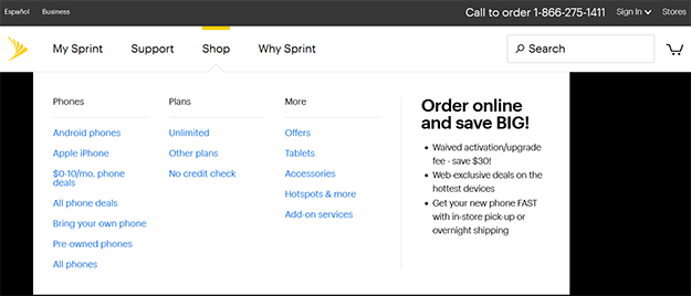
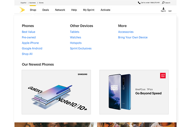
Iconic Devices already had a strong presence in the header. But customers shopping for less expensive phones had fewer obvious entry points.
We introduced Shop Your Way, a tabbed experience that organized devices by monthly price:
Under $10/Month
Starting at $10/Month
Starting at $15/Month
Rather than forcing customers through a generic product hierarchy, we gave them a way to self-select based on how they actually thought about their purchase.
The Visual Language
I led the visual direction, which intentionally moved Sprint away from the expected telecom aesthetic.
We used:
- Bold, direct messaging instead of promotional noise
- Playful illustration to inject personality
- Subtle motion and hover states to make interactions feel responsive
- Photography centered on real human moments, sometimes with the product and sometimes without it
The goal wasn’t to make Sprint look “cool.”
It was to make Sprint feel human.
Testing & Results
We developed three homepage prototypes and presented them to leadership, using the prototypes to explore different balances of content, imagery, promotion, and editorial storytelling.
Our final direction was then A/B tested against a variation with less copy and taller image blocks.
The final experience delivered:
169.3%
increase in Black Friday conversions
22%
increase in overall conversions
18%
increase in overall product orders
The impact extended beyond the homepage itself. The success of the experience helped create momentum for a broader navigation restructuring, turning a homepage redesign into an opportunity to rethink how customers moved through Sprint.com.
Homepage
Before
After
A/B Test

Final Design
Additional Homepage Redesign Concept
This first concept, nicknamed Ragnarok, was our most ambitious and futuristic direction.
We asked ourselves: If we could finally build the Sprint homepage we’d been dreaming about for years, what would it look like?
Instead of limiting ourselves to what the existing site could support, we explored what the experience could become.
The concept expanded the homepage beyond products and promotions to include useful and editorial content, from help articles to curated experiences like our City Guide.
We also reimagined the header as a destination for large, inviting visuals centered around the things customers cared about most: network coverage, Iconic device pre-orders, and localized messaging.
The localized approach was especially relevant to several 5G initiatives I had worked on, giving us an opportunity to bring more personalized, contextually relevant content into the homepage experience.
Ragnarok ultimately became a way to explore a bigger question:
What if the Sprint homepage could be useful, not just promotional?


- UX Research: S. Vipparti
- UX Lead: A. Nash
- Copywriting: L. Thomas
- Illustration: J. Francis
- Authoring: K. Lewis