Art Direction & Design Exploration: T-Mobile Privacy Center Redesign
Overview
I led the end-to-end redesign and art direction of the T-Mobile Privacy Center, transforming a dense, compliance-focused experience into a more approachable, visually engaging destination. The redesign balanced legal requirements with user needs by improving information hierarchy, reducing unnecessary navigation, and introducing a more human, brand-aligned visual language.
The final experience featured large-scale storytelling illustrations, expandable content carousels, and clearer content organization that surfaced the most important information upfront—allowing users to find answers with fewer clicks while maintaining a single-page experience.
The Opportunity
The Privacy Center became more than a website redesign—it presented an opportunity to modernize T-Mobile’s digital design language.
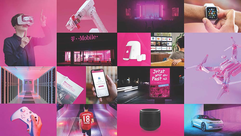
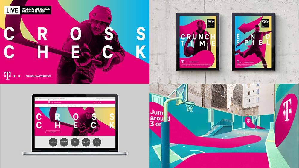
At the time, the company’s parent brand had introduced updated visual recommendations that had yet to be fully reflected across T-Mobile’s web properties. Rather than simply refreshing the interface, I used the project to explore how those recommendations could evolve into a richer, more engaging digital experience.
The goal was to create a Privacy Center that felt less like a legal resource and more like an extension of the T-Mobile brand.
Design Exploration
I explored several visual directions that expanded upon the existing design system while remaining true to the brand.
Key explorations included:
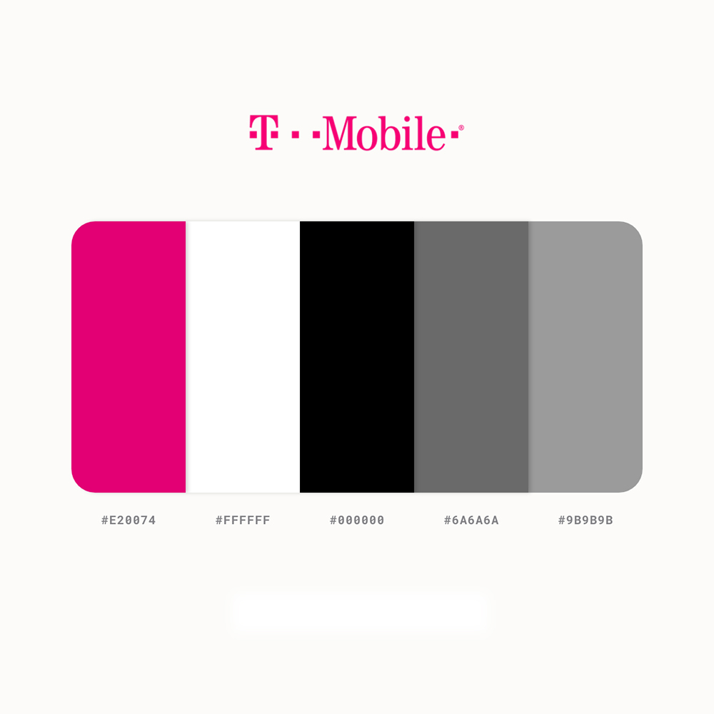
- Extending the T-Mobile color palette with subtle gradients and supporting accent colors to introduce greater depth
- Creating large-scale, narrative-driven illustrations using the existing icon library to make complex privacy concepts more approachable
- Reimagining page layouts with stronger visual hierarchy and increased whitespace
- Introducing content carousels and progressive disclosure patterns to present more information without dramatically increasing page length.
- Surfacing frequently accessed content earlier in the experience to reduce clicks and improve discoverability
These explorations demonstrated how the established brand could feel more expressive while maintaining consistency and accessibility
Brand Recommendations
Color Palettes
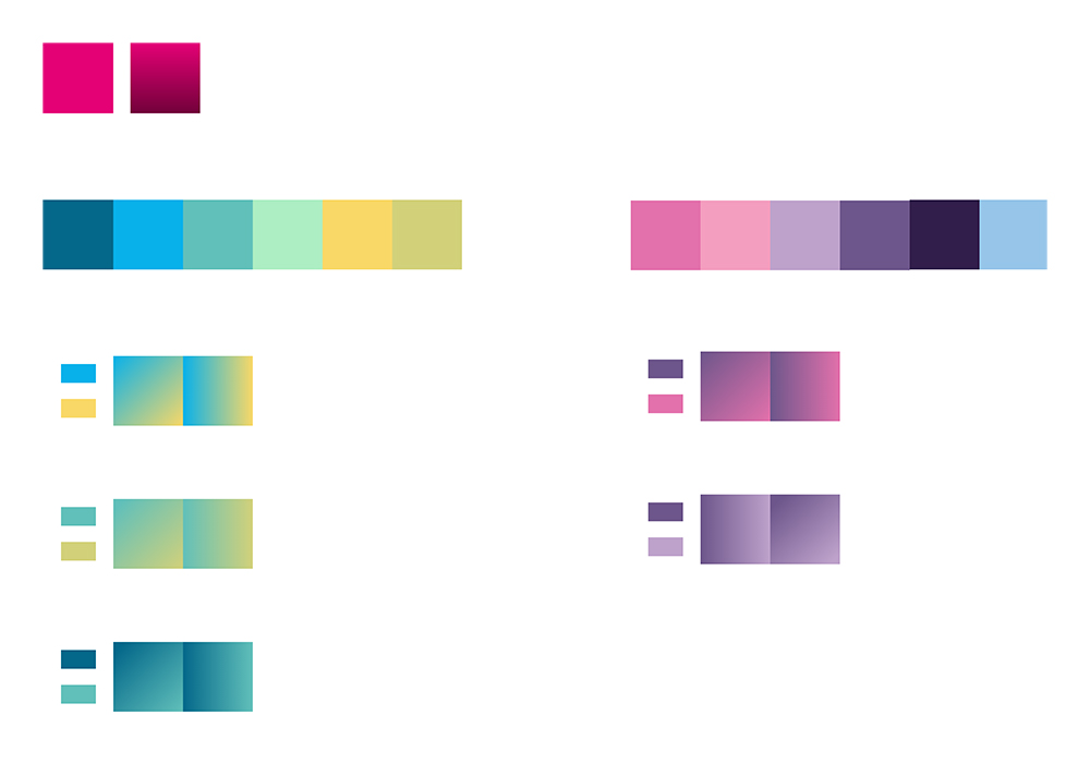
Illustration
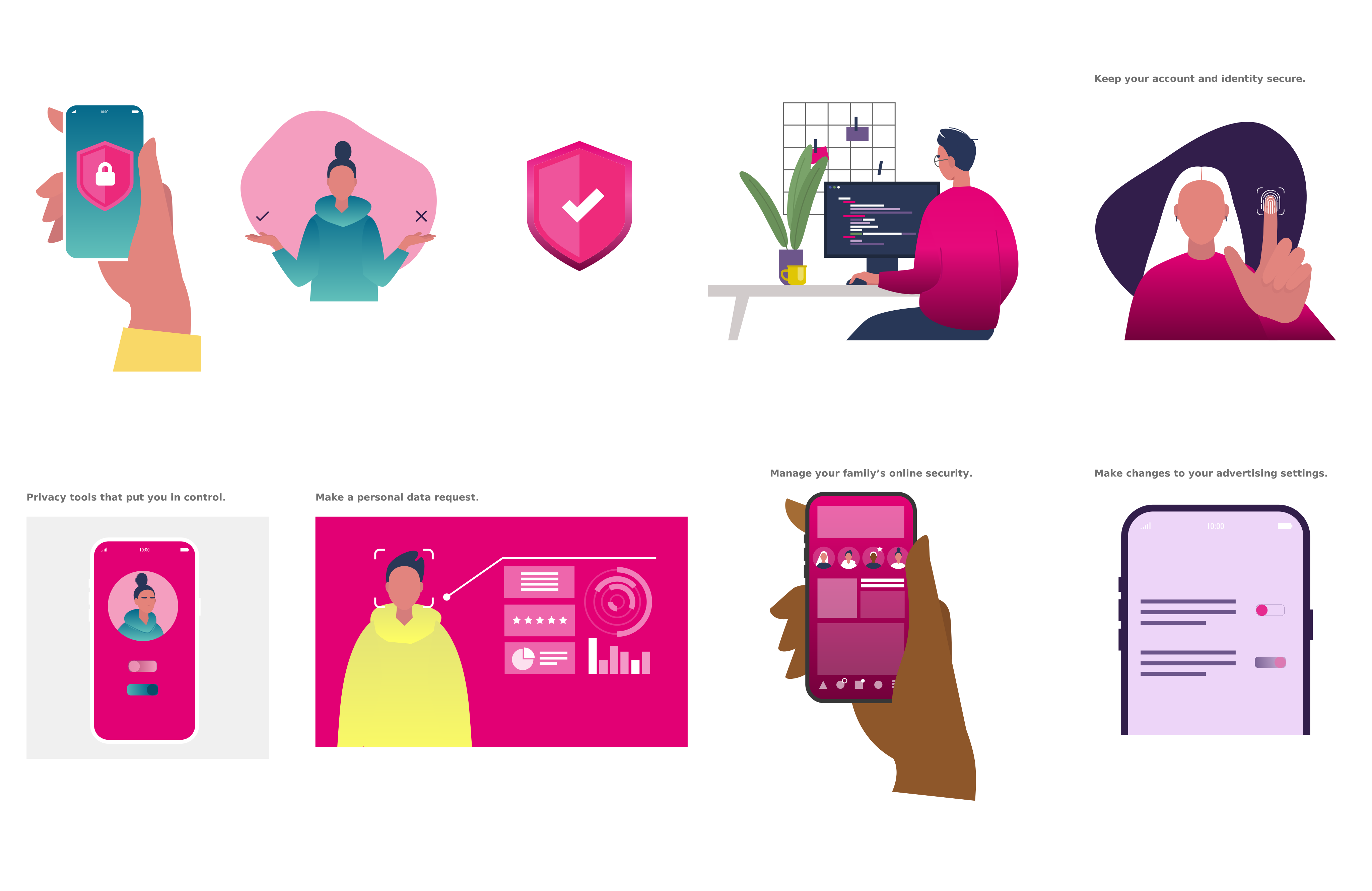
To create a more approachable experience, I developed a series of custom illustrations for the Privacy Center that transformed complex privacy topics into recognizable visual narratives. These illustrations highlighted core user tasks—including Privacy tools that put you in control, Make a personal data request, Manage your family’s online security, and Make changes to your advertising settings—while adding personality and reinforcing the brand throughout the experience.
Applying the Vision
The concepts were translated into responsive interface designs that balanced visual storytelling with usability.
Original Design
The original Privacy Center relied heavily on text, requiring users to navigate multiple pages to locate information.
![Privacy Center - Mobile [Old]](https://www.lanaeevans.com/wp-content/uploads/2021/08/Privacy-Center-Mobile-Old.jpg)
Exploration Design

My exploration introduced richer visual hierarchy, immersive illustrations, and content modules that allowed users to access related information without leaving the page.
Final Design
The final solution successfully blended brand storytelling with usability improvements, resulting in a more modern, engaging Privacy Center that reduced friction, surfaced key information earlier, and aligned more closely with T-Mobile’s evolving digital brand standards.

Results
- Led creative direction and UX from concept through final implementation
- Established a richer visual language aligned with evolving brand guidelines
- Improved content hierarchy and discoverability
- Reduced navigation depth by surfacing key information on a single page
- Created a more engaging, approachable experience for users navigating complex privacy information